
 In sifting through America’s pop culture detritus I’ve found Topps Trading Cards are elements that continually demand one’s attention. Consisting of a small handful of themed cards in a package that also contained a powdery stick of pink gum, trading card sets, spearheaded by the indomitable Topps, proliferated in the latter half of the Twentieth Century. It was then that Topps put out the highly controversial-for-its-time MARS ATTACKS! series, and the even more infamous GARBAGE PAIL KIDS. I’ve already covered both on this site, but there exist two more worthwhile Topps card sets in the form of CIVIL WAR NEWS, which actually predated MARS ATTACKS! (and was just as controversial), and the WWII themed BATTLE, that deserve an article of their own. Hence…
CIVIL WAR NEWS consisted of 88 cards depicting the carnage of the American Civil War of 1861-65, with, as was the Topps practice, mini-narratives on the back of each filling us in on what was being shown. The style and subject matter admittedly weren’t particularly novel or unique, having been utilized in a previous trading card set that predated CIVIL WAR NEWS by over twenty years.
HORRORS OF WAR was put out by Gum, Inc. back in 1938. It contained illustrations of atrocities from the Sino-Japanese War, the Spanish Civil War 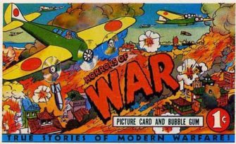 and other then-contemporary conflicts, rendered in startlingly bloody detail by artist Charles Steinbacher. Included are paratroopers on fire, a decapitated seaman, schoolkids blown to bits, mangled corpses arrayed in a sea of blood, an airman shot in the throat, dogs devouring corpses and a box-full of severed hands, accompanied by captions like “A loyalist submarine goes to a watery grave,” “Japanese Soldiers Burn their Dead” and “Woman Photographer Crushed by Loyalist Tank.” That these cards were aimed at children seems inconceivable, but they were, having been touted as “educational” and personally endorsed by President Franklin Roosevelt. Furthermore, they were quite successful, with over 100 packets allegedly sold by the end of 1938.
That the CIVIL WAR NEWS cards were inspired by HORRORS OF WAR is obvious, and was owned up to by their creator Len Brown. Working under the editorship of Woody Gelman, Brown began the CIVIL WAR NEWS (initially called CIVIL WAR CARDS) in 1961, the centennial of the Civil War. Brown was responsible for conceiving and writing the text of each card, admittedly planning the pictures first and then fleshing them out via “historic” captions in an effort to “tell an interesting story about the picture on the front.” To sweeten the package fake confederate money was included in every 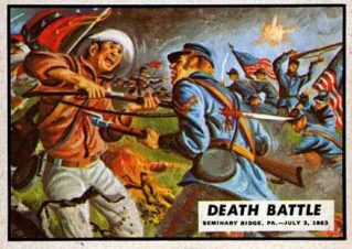 pack, which children of the era apparently loved.
According to Brown, “80 to 85 percent” of the stories related in his captions were “complete fiction pieces.” A few of the cards are authentic in their historical detail, such as #3, which details the attack on Fort Sumter that kicked off the Civil War, and #50, about the Union spy Pauline Cushman. Most of the rest are historically questionable, as in card #25, about a fictional “15 Year Old Hanged as Spy,” and #55, which relates the tragic death of a (nonexistent) 14 year old drummer boy.
The titles of the cards pretty much tell the story of each: “Bloody Combat,” “Painful Death” (Brown: “Painful death could have been about a dozen different ones I guess. Death was only too painful on those cards”), “Wall of Corpses,” “Shot to Death,” etc. Those titles are matched by the frankness of the captions: “A daring balloonist was struck by a cannon shell and plunged to his death in flames,” “Struggling to survive the whirlpool, the men panicked and pulled one another down under the sea,” “Cannons were fired at charging soldiers at point-blank range, leaving little left of the poor souls who were hit.” Such language may not be subtle or refined, but does its job admirably.
The real selling point of these cards is the artwork. Bold, colorful and unabashedly sensationalistic (in a manner that nowadays passes for High Art), 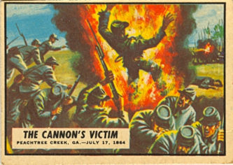 the images are museum worthy examples of draftsmanship. Credit goes to penciller Bob Powell and the initial colorist Maurice Blumenfeld, who was replaced early on by the prolific pulp novel cover artist Norm Sanders, who ended up rendering the majority of the cards in gorgeous Tempera painted hues. Not that this renders the imagery—of soldiers blown apart by cannon fire, a seaman expiring from an especially bloody chest wound, up-close impalements via swords and bayonets, a shark(!) attack and an alligator stabbing—any less lurid.
CIVIL WAR NEWS was successful enough that Len Brown and Norm Sanders were asked to create another trading card series the following year, which was MARS ATTACKS! The history of that iconic series has been well documented (here and elsewhere), so we’ll skip forward a bit to 1965, when the 66 card BATTLE set was introduced.
Brown and Sanders once again did the scripting and artwork of a series that goes even farther than CIVIL WAR NEWS did in terms of beautifully rendered depictions of wartime atrocities. According to Brown, “I guess blood and guts and good artwork will win every time.” Well, not every time, as BATTLE wasn’t nearly as successful as its predecessors. Its muted reception put a permanent end to the “serious” Topps cards, with subsequent sets (such as the hugely successful WACKY PACKAGES series) being humorous in nature.
 Part of the problem with BATTLE’S reception may have been, simply, that it was too much like its war themed predecessor. The titles and artwork of the two sets are often suspiciously similar—“Death Struggle” is a title that recurs in both sets, and the CIVIL WAR NEWS card “Flaming Death” depicts an image that looks much like the one pictured in the BATTLE card “Fiery Death”—to the point that upon looking at them side-by-side a definite sense of déjà vu sets in.
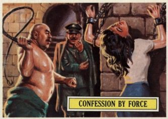
Another problem is the fact that only the first 53 of BATTLE’S 66 cards are actually battle themed, with the remaining ones taken up with portraits of various “Fighting Men of World War II.” The latter include a “U.S. Sailor,” “U.S. Marine” and “Japanese Soldier,” along with real-life figures like Charles DeGualle, Winston Churchill and Gen. Douglas MacArthur. Important people, yes, but those final 13 cards are a definite mood-killer, and close out the series on an unsatisfying note (not least because the final Battle-themed card “Beautiful Spy,” about the exploits of one “Belle Byrd,” is quite unresolved, ending with the decidedly anti-climactic line “Angered by their failure to learn anything, the soldiers set fire to the nightclub and watched as it burned to the ground”).
Yet the BATTLE cards are impressive, in some ways even more so than their predecessors. The Brown scripted captions are markedly improved, being more stark and dramatic than those of CIVIL WAR NEWS, and offering up terrifically overripe sentences like “The G.I.s spoke of their hopes and dreams as they pushed the 105 Howitzer up the hill…But they couldn’t reckon on the two pound package of death which was now headed toward them…,” “As the Allied plane fired at him, the seaman screamed in terror. Slowly the waters rose around him, claiming their victim” and “Finally the bullets cut into him, bringing a moment of intense pain, then darkness.” Norm Sanders’ artwork, for its part, is far more uniform and confident than it was in CIVIL WAR NEWS, with images that match those of the famously grungy pulp cover art for which he’s best known.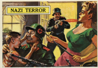
Once again Messrs. Brown and Sanders play fast and loose with historical detail, as in card #5, which relates the escape of the nonexistent “Capt. Dis Hassin” from a flaming plane, and the capture of the equally fictitious “Brad Barnett” by the Germans, while once again providing a great deal of artfully rendered carnage: a man crushed under the tread of an oncoming tank, a Japanese soldier getting a mouthful of an American soldier’s rifle butt, a schoolteacher blown up in front of her students, stranded pilots engulfed by flames, etc.
The BATTLE series, in short, is a triumph in spite of its flaws, just as CIVIL WAR NEWS, MARS ATTACKS and GARBAGE PAIL KIDS were also. Together they make for a singularly demented cavalcade of artfully rendered nastiness that, taken with their forefather HORRORS OF WAR, comprise an irresistible quintet.